Digital Style Guide

Color

Color in digital properties are our primary visual link to the Honest Ag campaign. Our colors are distinct in the industry, and are especially effective at communicating energy and innovation in the agriculture technology space.

Base Digital Colors

The base colors make up the majority of container backgrounds and text content. These provide contrast for accessibility and a neutral base for easy composition.

Honest Ag Blue RGB - 11 63 84 HEX - 0B3F54
White RGB - 255 255 255 HEX - FFFFFF
20% Gray RGB - 245 244 242 HEX - F5F4F2
40% Gray RGB - 236 232 229 HEX - ECE8E5

Action Colors

Action colors are reserved for important, high visibility content or calls to action. These should be used sparingly and in conjuction with the base colors (see usage proportions), but not combined with each other.

Honest Ag Green RGB - 111 200 192 HEX - 6FC8C0
Honest Ag Yellow RGB - 254 209 21 HEX - FED115
Honest Ag Red RGB - 231 80 75 HEX - E7504B

Usage Proportions

Using color proportions correctly results in a balanced design that is legible, usable, and consistent with the Honest Ag styles. These proportions are tailored to digital content for accessibility compliance.

Color Guidance

Example of overlapping action colors

Overlapping action colors - causing vibrating color effect.

Example of incorrect basic color proportions

Incorrect basic color proportions.

Example of type set in action colors

Setting type in action colors.

Example of improper use of blend modes

Using blend modes over full color photos (see photography section for photo use).

Example of blend modes on solid colors

Using blend modes on solid colors (see photography section for photo use).

Examples of new colors not on brand

Creating new color variations.

Accessibility Compliance

WinField United complies with WCAG 2.0 AA accessibility standards to provide visually impaired users with a fully functional, positive experience on our digital properties. Compliance with these rules (including color contrast, type size, and more) is essential to maintaining inclusive, helpful digital content for all users.

Honest Ag Blue

20% Gray

Contrast 10.3:1

Normal Text (4.5:1)

Large Text (3:1)

Honest Ag Blue

40% Gray

Contrast 9.3:1

Normal Text (4.5:1)

Large Text (3:1)

Honest Ag Blue

Honest Ag Green

Contrast 5.77:1

Normal Text (4.5:1)

Large Text (3:1)

Honest Ag Blue

Honest Ag Yellow

Contrast 7.74:1

Normal Text (4.5:1)

Large Text (3:1)

Honest Ag Blue

Honest Ag Red

Contrast 3.05:1

Normal Text (4.5:1)

Large Text (3:1)

Honest Ag Green

20% Gray

Contrast 1.8:1

Normal Text (4.5:1)

Large Text (3:1)

Honest Ag Green

40% Gray

Contrast 1.6:1

Normal Text (4.5:1)

Large Text (3:1)

Honest Ag Yellow

20% Gray

Contrast 1.5:1

Normal Text (4.5:1)

Large Text (3:1)

Honest Ag Yellow

40% Gray

Contrast 1.2:1

Normal Text (4.5:1)

Large Text (3:1)

Typography

The following styles are intended for use in digital applications of the Winfield United Honest Ag style. Where specific web type styles are absent or unique, development should always follow WCAG 2.0 AA guidelines as a baseline. Print typography styles should not be used in digital applications.

Voice & Tone

Coming soon.

Global Headings

Heading styles provide structure to a body of copy, and should be written to help a user navigate through a page (both visually and via keyboard controls) using helpful, human language.

H1 Desktop

font-family: 'TitlingGothicFB Comp';
font-weight: 700;
font-size: 72px;
color: #0B3F54;
letter-spacing: 2px;
line-height: 76px;
text-transform: uppercase;

H1 Mobile

font-family: 'TitlingGothicFB Comp';
font-weight: 700;
font-size: 72px;

H2 Desktop

font-family: 'Acumin Pro Condensed';
font-weight: 700;
font-size: 48px;
color: #0B3F54;
line-height: 52px;

H2 Mobile

font-size: 32px;
line-height: 32px;

H3 Desktop

font-family: 'Acumin Pro Condensed';
font-weight: 700;
font-size: 32px;
color: #0B3F54;
line-height: 36px;

H3 Mobile

font-size: 24px;
line-height: 28px;

H4 Desktop

font-family: 'Acumin Pro Condensed';
font-weight: 700;
font-size: 24px;
color: #0B3F54;
line-height: 24px;

H4 Mobile

font-size: 20px;
line-height: 20px;

Specialty Headings

Certain heading styles should be reserved for specific hierarchy purposes.

Subhead Desktop
font-family: 'Acumin Pro Condensed';
font-weight: 700;
font-size: 28px;
color: #0B3F54;
letter-spacing: 0;
line-height: 38px;
Subhead Mobile
font-size: 24px;
line-height: 34px;
Section Title Desktop
font-family: 'Acumin Pro Condensed';
font-weight: 700;
font-size: 20px;
color: #0B3F54;
letter-spacing: 0.2px;
line-height: 20px;
text-transform: uppercase;
Section Title Mobile
font-size: 14px;
line-height: 14px;

Paragraph

This is paragraph text. Aenean lacinia bibendum nulla sed consectetur. Praesent commodo cursus magna, vel scelerisque nisl consectetur et. Maecenas faucibus mollis interdum. Lorem ipsum dolor sit amet, consectetur adipiscing elit. Praesent commodo cursus magna, vel scelerisque nisl consectetur et.

font-family: 'Acumin Pro'
font-weight: 400;
font-size: 16px;
color: #0B3F54;
letter-spacing: 0;
line-height: 28px;

Lists

  • Unordered List Item 1
  • Unordered List Item 2
  • Unordered List Item 3
font-family: 'Acumin Pro Condensed';
font-weight: 500;
font-size: 18px;
color: #0B3F54;
letter-spacing: 0;

Note: bullet style implementation to be determined in production (prioritize accessibility)
  1. Ordered List Item 1
  2. Ordered List Item 2
  3. Ordered List Item 3
font-family: 'Acumin Pro Condensed';
font-weight: 500;
font-size: 18px;
color: #0B3F54;
letter-spacing: 0;

Hierarchy

Type should be organized in a hierarchical system according to relative importance and accessibility guidelines. Emphasis should be given to high level topics in headings, followed by body copy in paragraphs. There are sub heads and section titles to help introduce new content or extend context after headings.

This is a heading

This is a sub heading

This is paragraph text. Aenean lacinia bibendum nulla sed consectetur. Praesent commodo cursus magna, vel scelerisque nisl consectetur et.

Pages commonly start with an H1 and subhead. The subhead may be used to add context to the H1 while keeping the page heading short.
This is a new section

This is the section heading

This is paragraph text. Aenean lacinia bibendum nulla sed consectetur. Praesent commodo cursus magna, vel scelerisque nisl consectetur et.
(Mobile styles used for example)

Section titles should describe the type of content that follows, or give reason to a new section beginning. Heading 2 is then used to introduce the topic of that content.
(Mobile styles used for example)

Layout

The WinField United website uses responsive, fluid, and re-purposable layout patterns. Based on a 12-column grid, the sections and containers follow a few basic styles that allow for extensibility and consistency amongst components.

Responsive Grid

A responsive grid system creates consistent layouts and ensures proper accessibility and usability at all screen sizes. The following are guidelines for general types of components, though best design discretion should be taken while building new pages.

Long form content: 8 columns

This includes news post content. Note that other elements on the news page may fit into the other column configurations below.

General body content: 10 columns

This includes short text blocks, videos, large photos, and sectioned content containers amongst other things.

Wide content, groups: 12 columns

Content that requires a wider container (like tables) or groups of components (like cards).

Cards

Cards are most frequently configured in 2-across or 3-across layouts on desktop (and stack 1-up on mobile). Special use cards may diverge from this where necessary.

Special: Full-width article

Full width article cards may be used to highlight related content at the end of the page. They should be used when the topic is expected to have few related articles, thus not warranting two or more cards.

In the instance of post lists (such as News & Insights), users may have an option to toggle between full-width and 3-across layouts.

Special: Significant content cards

Some content is significant enough to be visually separated from body content. In this case an 8-column or 10-column card may be used, depending upon the surrounding components layout. For example, use 8-column cards to break up long pages of 10-column content. These cards often contain a variety of elements (text, icons, images) and do not have a set image orientation.

Call to Action

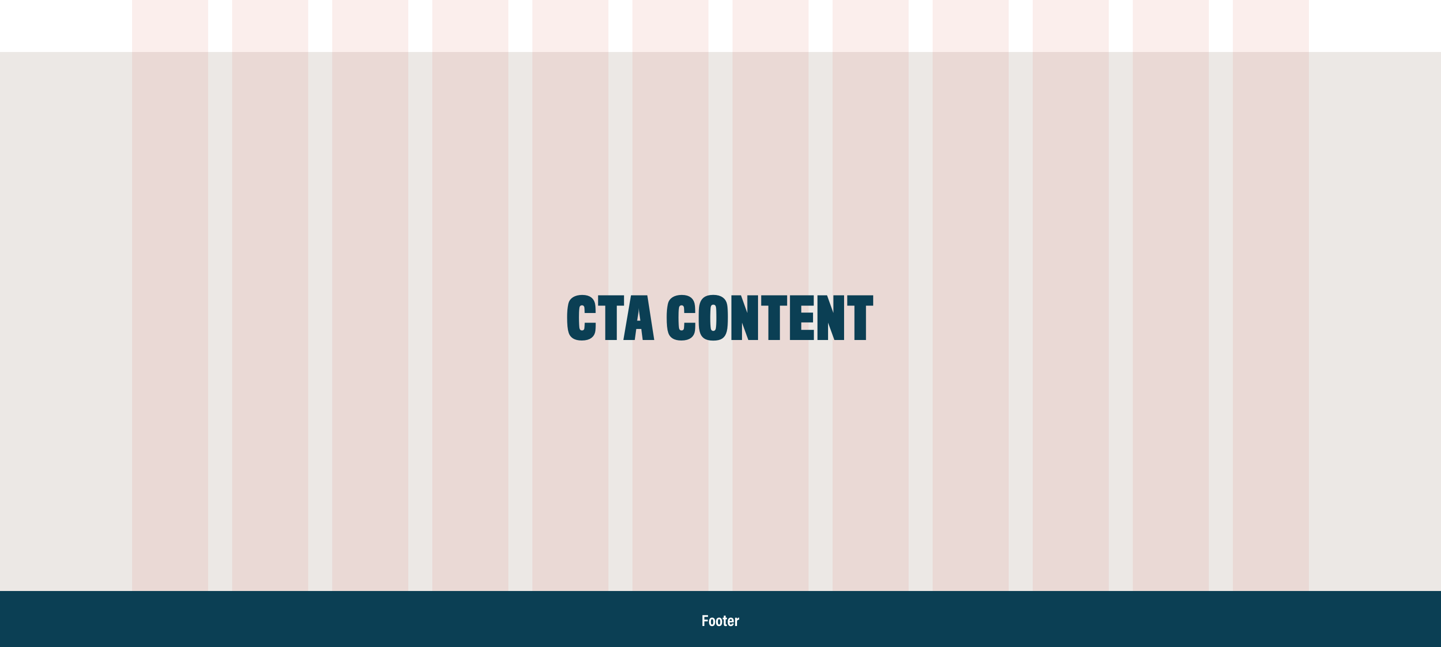
Calls to action may be highlighted at the bottom of the page by a viewport-width container that breaks outside of the grid. These containers have a darker background and typically appear at the bottom of a page just above the footer.

Motion

Motion plays a significant role in a user's experience in digital. It helps direct interactions, provide feedback, and convey emotion. Careful implementation of motion design can greatly strengthen a brand's presence in digital. The following are a couple of guidelines, but all motion design decisions should involve consulting a designer and developer for accessible implementation.

Basic Styles

To create consistency in WinField United motion design, we have set a few basic styles that apply to all types of motion in digital properties.

Scale

Use scale to reverse two colors on hover.

Position

Use position to imply action on hover.

Text Label

Color Shift

Shift color (not opacity) to provide feedback.

Feedback

Motion feedback provides users with confirmation that their action — hover, click, focus, etc — has been successful. Elements that require feedback include buttons, text links, image links, and filter controls.

Text Link

Hover to see example.

Primary button

Hover to see example.

Button with icon

Hover to see example.

Transitional

Transitional motion helps a user understand that content is changing, becoming available, or becoming unavailable. It illustrates a change in state of elements on the screen. This can include expanding an accordion, switching tabs, and scrolling to an anchor link on a page. These actions can happen instantaneously, but the addition of motion allows the user to see that the action is happening as expected and confirm when it is successful.

Accessibility

Accessibility in motion design is still evolving with the updates in WCAG 2.1, so documentation should be referenced frequently. In addition to providing accessible methods of motion, an important tenant of motion design is using restraint in motion design. Often the most accessible experience is one without motion altogether, or with the ability to disable animation should the user prefer it.

https://www.w3.org/WAI/WCAG21/Understanding/animation-from-interactions.html

https://uxpamagazine.org/how-to-make-motion-design-accessible/

Decorative

Decorative motion, or motion that is not required for usability and accessibility, should be used sparingly but can have a positive impact on the user's experience with a brand. Decorative text and certain motion styles can be exempt from WCAG 2.0 guidelines, but we should strive for full accessibility wherever possible.